Designing an effective brochure is essential for any marketing professional aiming to make a lasting impression. However, there are several brochure design mistakes to avoid to ensure that your message is delivered effectively.
Understanding these mistakes and learning how to bypass them can transform your brochure from a simple piece of paper into a powerful marketing tool.

Understanding the Purpose of a Brochure
Before diving into design mistakes, it’s crucial to understand the primary purpose of a brochure. A brochure serves to inform, engage, and persuade the target audience about a product, service, or event. Its design should align with these goals to be effective.
Avoiding Common Layout Errors
Overcrowding with Information
One of the most prevalent mistakes is overcrowding the brochure with too much information. This can overwhelm your readers. Instead, focus on clear, concise messaging with ample white space for readability.
Poor Hierarchy of Information
Ensure that your brochure has a logical flow of information. Start with capturing attention with bold headlines, followed by supportive details. This structure helps guide your audience through the brochure smoothly.
Choosing the Right Colors and Fonts
Inconsistent Color Scheme
Stick to a consistent color scheme that aligns with your brand. Using too many colors can make your brochure look unprofessional and disjointed. Consider consulting resources like PrintRunner’s article on brochure types for more insights.
Unreadable Font Choices
Select fonts that are easy to read and appropriate for the tone of your brochure. Avoid overly decorative fonts that may be difficult to understand at a glance. Your audience should focus on the message, not deciphering your text.
Ensuring High-Quality Images
Low-quality images can tarnish the professional appearance of your brochure. Use high-resolution photos that are relevant and enhance the overall design.
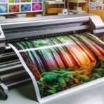
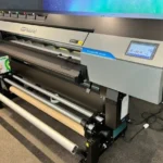
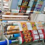
Paying Attention to Print Quality
Print quality is another crucial aspect not to overlook. Opt for reliable printing services like those discussed in this guide to reliable brochure printing to ensure your final product is of the highest quality.

FAQ Section
What is the main purpose of a brochure?
A brochure’s main purpose is to inform, engage, and persuade its audience regarding a product, service, or event.
Why is color consistency important in brochure design?
Color consistency ensures that the brochure looks professional and is in alignment with your branding, preventing a disjointed appearance.
How can poor print quality affect brochure perception?
Low print quality can make the brochure appear unprofessional and may detract from the intended message, affecting how potential customers perceive your brand.
This article contains affiliate links. We may earn a commission at no extra cost to you.