Standing out on crowded shelves is a constant challenge for brands. One of the most effective ways to capture consumer attention is through the use of trends in high-contrast packaging colors. Bold, visually striking color combinations not only make products more noticeable but also help communicate brand personality and values at a glance. As competition intensifies and consumer preferences evolve, understanding how to leverage these color trends can make a significant difference in brand recognition and sales.
In this article, we’ll explore the latest developments in high-contrast color usage for packaging, why these choices matter, and how brands can implement them effectively. We’ll also highlight practical considerations for designers and marketers, including production techniques and the impact of digital tools. For those interested in speeding up their packaging development process, learning about what is digital prototyping for packaging can offer valuable insights.
Why High-Contrast Color Palettes Are Gaining Popularity
Modern consumers are bombarded with visual information both online and in stores. As a result, packaging must work harder than ever to grab attention. High-contrast packaging color trends are gaining traction because they create strong visual separation between elements, making text and graphics easier to read and recognize from a distance.
Brands are increasingly using sharp color contrasts—such as black and yellow, blue and white, or red and green—to create memorable packaging. These combinations not only improve shelf visibility but also evoke emotional responses, helping products stand out in a split second. For example, pairing a dark background with a vibrant accent color can make a logo or product name pop, while contrasting hues can signal freshness, excitement, or luxury depending on the palette.
Key Trends in High-Contrast Packaging Colors
Several color strategies are emerging as leaders in the world of packaging design. Here are some of the most notable approaches shaping the market:
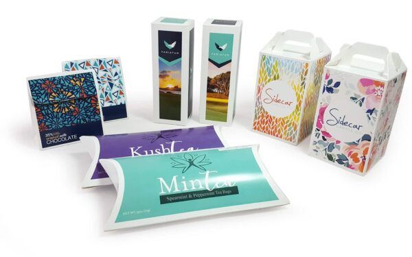
- Monochrome with a Pop: Using a single neutral or muted tone as the base, brands add a bold accent—such as neon green or electric blue—for maximum impact.
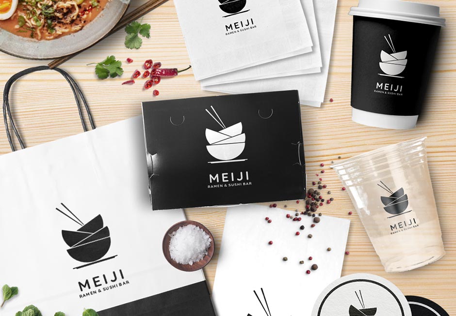
- Classic Black and White: This timeless combination remains a favorite for its clarity and sophistication. It’s often paired with a single bright color for added energy.
- Unexpected Pairings: Designers are experimenting with unusual color duos, like magenta and teal or orange and purple, to create a sense of novelty and intrigue.
- Gradient Contrasts: Gradients that blend two or more contrasting colors are being used to add depth and movement to packaging, making products appear more dynamic.
These approaches are not just about aesthetics—they also play a crucial role in brand storytelling and differentiation. For example, a company targeting Gen Z consumers might choose bold, unconventional contrasts to signal innovation and break from tradition. For more on connecting with younger audiences, see our guide on how to design packaging for Gen Z consumers.
How High-Contrast Colors Influence Consumer Perception
Color psychology is a powerful tool in packaging design. High-contrast combinations are proven to enhance recall and influence purchasing decisions. When consumers scan a shelf, their eyes are naturally drawn to items that stand out due to strong color differentiation. This effect is especially important in categories with little product differentiation, such as beverages or snacks.
Research shows that packaging using contrasting color schemes can increase brand recognition by up to 80%. The right palette can also communicate key brand attributes—such as trustworthiness, excitement, or sustainability—without the need for words. For global brands, managing color consistency across markets is essential. Leveraging the benefits of cloud-based color management can help ensure that high-contrast palettes remain vibrant and accurate, no matter where products are produced or sold.
Production Techniques for Vibrant Contrasts
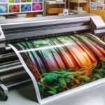
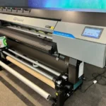
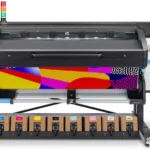
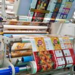
Achieving crisp, high-contrast visuals requires careful attention to print technology and materials. Advances in digital printing and flexible packaging have made it easier for brands to experiment with bold color choices without sacrificing quality or increasing costs. For a deeper dive into how digital and flexible printing are shaping the future of packaging, see this analysis of flexible packaging and digital printing trends.
Some practical tips for designers and production teams include:
- Choose substrates that enhance color vibrancy, such as coated papers or films.
- Use spot colors or special inks to achieve maximum contrast and consistency.
- Test color combinations under different lighting conditions to ensure legibility and appeal.
- Consider sustainability by selecting eco-friendly inks and recyclable materials.
For brands seeking even more visual impact, specialty finishes like holographic lamination can add a tactile and reflective quality to packaging. Learn more about these techniques in our article on what is holographic lamination.
Best Practices for Implementing High-Contrast Color Schemes
To make the most of current trends in high-contrast packaging colors, brands should follow these best practices:
- Prioritize Readability: Ensure that text and essential graphics remain legible against background colors. Avoid combinations that strain the eyes or reduce accessibility.
- Stay Consistent with Brand Identity: Select contrasts that align with your brand’s core values and target audience. Consistency across product lines helps reinforce recognition.
- Test with Real Consumers: Gather feedback on color choices through focus groups or A/B testing. What looks bold on screen may not translate the same way in person.
- Adapt for Digital and Physical Channels: Remember that packaging must look great both on shelves and in online product listings. Optimize color choices for both environments.
Brands that embrace these principles are better positioned to capture attention and foster loyalty, especially as consumers increasingly seek out products that reflect their own sense of style and values.
FAQ: High-Contrast Packaging Color Trends
What are the main benefits of using high-contrast colors in packaging?
High-contrast color schemes make products more noticeable, improve readability, and help brands differentiate themselves in crowded markets. They also enhance recall, making it easier for consumers to remember and recognize products later.
Are there any risks to using bold color contrasts?
While striking color combinations can boost visibility, overuse or poor pairing can lead to visual fatigue or confusion. It’s important to balance boldness with clarity and ensure that packaging remains accessible to all consumers, including those with color vision deficiencies.
How can brands keep up with evolving color trends?
Staying informed about industry developments, consumer preferences, and new printing technologies is key. Brands should regularly review their packaging designs, test new color combinations, and leverage digital prototyping to quickly adapt to changing trends.