In today’s competitive retail landscape, typography is more than just a design detail—it’s a strategic tool for brands aiming to stand out on shelves and online. The way words are styled, arranged, and integrated into packaging can influence a consumer’s perception, build brand recognition, and even affect purchasing decisions. Understanding how to use typography in modern packaging design is essential for designers and brand managers who want to create memorable, effective packaging that communicates clearly and attracts attention.
This article explores practical strategies for leveraging type in contemporary packaging, from choosing the right fonts to balancing readability with creativity. We’ll also highlight current trends and provide actionable tips to ensure your packaging not only looks appealing but also supports your brand’s goals. For those interested in the technical side of packaging innovation, you might also want to learn about what is digital prototyping for packaging and how it can accelerate your design process.
Why Typography Matters in Packaging
The role of typography in packaging extends far beyond aesthetics. The typefaces, font sizes, and arrangements you choose communicate your brand’s personality, values, and promise at a glance. Well-executed type can:
- Enhance brand recognition by using consistent fonts and styles across product lines.
- Improve readability so key information—such as product name, ingredients, and usage instructions—is clear and accessible.
- Influence purchasing decisions by evoking emotions or signaling quality, sustainability, or innovation.
- Differentiates your product from competitors on crowded shelves.
As packaging evolves to meet the needs of digital and physical retail, the importance of effective type design only increases. Brands that master this aspect of design are better positioned to engage consumers and build loyalty.
Key Principles for Using Type in Modern Packaging
To make the most of typography in packaging design, consider these foundational principles:
1. Prioritize Readability and Legibility
No matter how creative your design, the primary function of type is to communicate. Choose fonts that are easy to read at various sizes and distances. Avoid overly decorative scripts for essential information. Maintain strong contrast between text and background colors to ensure clarity in different lighting conditions.
2. Align Typography with Brand Identity
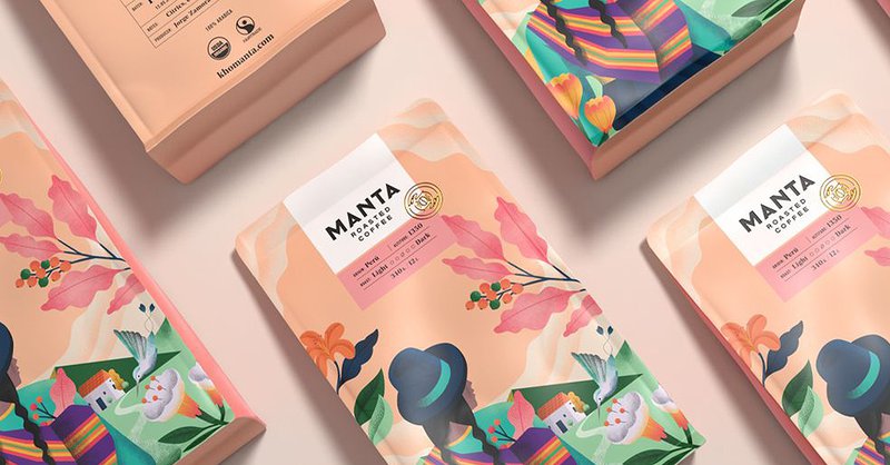
Your choice of typeface should reflect your brand’s personality. For example, a minimalist sans-serif font may suit a tech-forward brand, while a hand-lettered script can convey artisanal or organic qualities. Consistency across packaging and marketing materials reinforces recognition and trust.
3. Create Hierarchy with Font Styles and Sizes
Use font weights, sizes, and spacing to establish a clear visual hierarchy. The product name should stand out, followed by secondary details like flavor, size, or key benefits. Supporting information, such as instructions or legal text, should be smaller but still legible.
4. Balance Creativity with Function
Modern packaging often features bold, experimental type treatments. While creativity can help your product stand out, always test designs for legibility and accessibility. Consider how the packaging will look in different environments and on various devices if sold online.
Current Trends in Typography for Packaging
Staying up to date with the latest trends can help your packaging feel fresh and relevant. Here are some notable directions in modern packaging typography:
- Bold, oversized lettering that commands attention and simplifies messaging.
- Custom typefaces designed specifically for a brand or product line, enhancing uniqueness.
- Minimalist layouts with generous white space, letting the type breathe and increasing impact.
- Variable fonts that adapt to different packaging shapes and sizes, improving flexibility.
- Retro and vintage-inspired type for brands seeking nostalgia or authenticity.
For a deeper look at how digital technology is shaping the future of packaging, check out this insightful article on the future of digital packaging.
Practical Tips for Designers and Brands
Applying the principles of typography in packaging requires attention to detail and a willingness to experiment. Here are some actionable tips:
- Test at actual size: Always print prototypes at real-world scale to check legibility and visual impact.
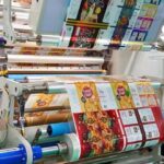
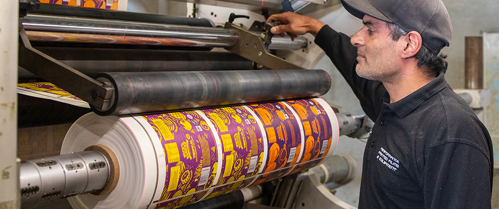
- Consider printing methods: Some effects, like embossing or foil stamping, can enhance type but may affect readability if overused.
- Use color wisely: High-contrast combinations improve readability, while subtle tones can convey sophistication.
- Stay consistent: Use a limited palette of typefaces and styles across your packaging range.
- Think about accessibility: Ensure your type choices are readable for people with visual impairments by avoiding overly thin fonts or low-contrast color schemes.
Integrating Typography with Other Packaging Elements
Effective packaging design is about harmony. Type should work in concert with imagery, color, and materials. For example, if your packaging features bold graphics or holographic finishes, opt for simpler fonts to avoid visual clutter. If you’re interested in specialty finishes, you might explore what is holographic lamination for eye-catching effects.
Additionally, consider how your type will appear in both physical and digital contexts. With the rise of e-commerce, packaging must look compelling in product photos and on screens as well as in person. Consistency across touchpoints helps reinforce your brand’s message.
FAQ: Typography in Packaging Design
What are the most important factors when choosing fonts for packaging?
The top considerations are readability, alignment with brand identity, and suitability for the product category. Always test fonts at actual size and in context to ensure they communicate clearly and support your brand’s goals.
How can I make my packaging stand out using type?
Use bold or custom typefaces, establish a strong visual hierarchy, and experiment with layout and color. However, balance creativity with clarity—your message should always be easy to read. Incorporating unique finishes or printing techniques can also enhance the impact of your typography.
What are some common mistakes to avoid?
Overusing decorative fonts, sacrificing legibility for style, and failing to consider how type will print or display in different environments are frequent pitfalls. Stick to a limited number of typefaces, maintain strong contrast, and always test your designs in real-world conditions.
Conclusion
Mastering how to use typography in modern packaging design is a blend of art and strategy. By prioritizing clarity, aligning type choices with your brand, and staying aware of current trends, you can create packaging that not only looks great but also communicates effectively and drives consumer engagement. For brands looking to further optimize their packaging workflow, exploring the benefits of cloud-based color management can offer additional advantages in consistency and efficiency.